POP gets a graphic makeover!
When it was created in 2015, POP di Baladin made a statement as a provocative pop symbol of Italian craft beer. It was provocative because it was the first Italian craft beer in a can. It literally paved the way for cans - historically, used by industrial beer makers - among Italian craft brewers, who soon decided to adopt them for their convenience of use.
Teo said: “Using cans was an idea I had been playing with for quite some time: I wanted to show that you can make high quality beer regardless of the packaging.”
POP has a pop soul: it has a strong personality, but it is enjoyable for everyone. It also has a pop style and graphic concept, which has evolved through three versions.
Let’s take a look at POP’s three evolutions
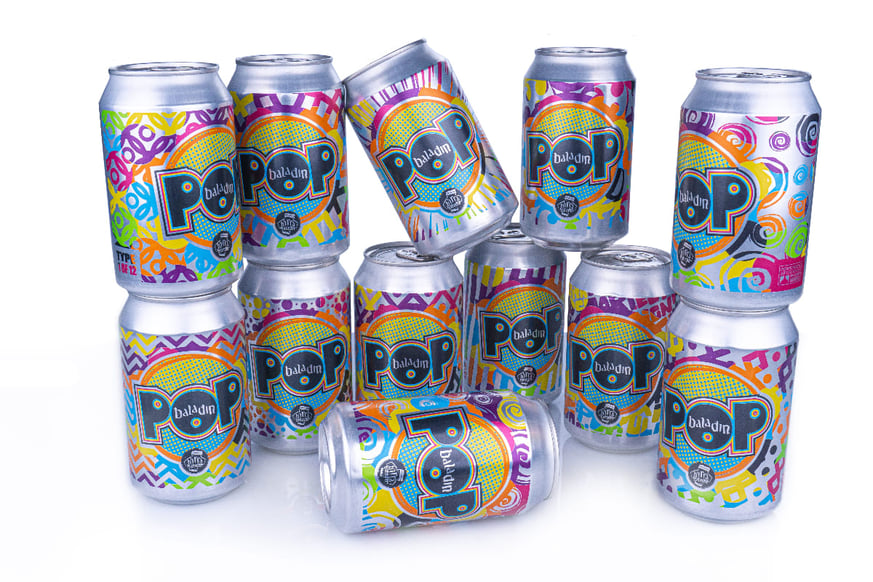
The first can was launched in six different color versions and used a label. The beer in the six different cans was exactly the same, which was quite provocative for distributors and end consumers. The inspiration came from a practice that was dear to pop art in the 1950’s and ‘60s, when the same work of art was made in different color versions. The idea was to create a desire for collectibles.
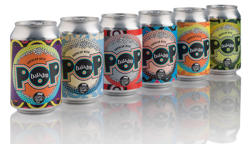
2019 saw the first revolutionary image change. Not only a change of color but also a change of graphics, with 12 different subjects and each can identified by its version number (1 of 12,...). Irresistible for collectors! One year of hard work by Baladin's graphic designers and the development department of the English can manufacturer Crown Bevcan which, to make this crazy idea possible, adopted a variable printing technique called “Accents™”. It had never been used before on such large surfaces. The result was a huge success among both consumers and packaging experts, who acknowledged POP with a prestigious award for technical innovation given by the “International Metal Decorating and Packaging Association”.
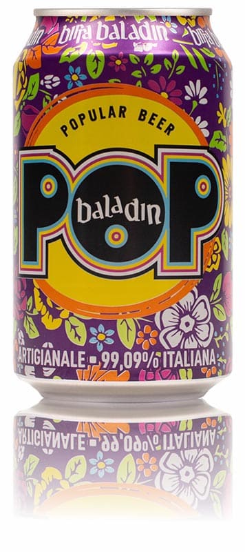
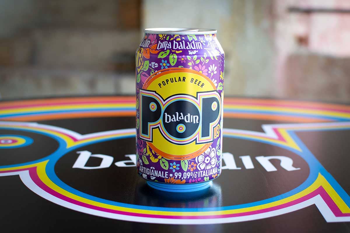
2021: the year of the easy-open end and of a total makeover. The new POP di Baladin has a brand new image, which breaks with everything that has been done until now. The graphic design is now one and is more similar to the line of its “sisters in a can” that have been created in the meantime (Nazionale, L’IPPA, Super Bitter, Rock’n’Roll and… Sud di Baladin is coming soon). The background shows the same flowers that are already used on the bottle labels.
However, there’s a pop touch in the many colors and fun color combinations against a purple background. Tidbits for collectors? Sure: in the first production, an innocent mistake in the conversion of a file created a completely white flower that will make POP 2021 unique. The technical innovation is in the use of the “360®” easy-open end developed by Crown Bevcan and used exclusively by Baladin in Italy. This system completely eliminates the top lid of the can turning it into a glass for the beer it contains. An unquestionably green approach because aluminum can be recycled infinitely, it avoids the use of plastic cups or having to wash glasses. In pure pop style, the can also transforms into a container that can become a pen holder or a small pot for succulent plants... Set your imagination free with the new POP di Baladin: good, beautiful, environmentally friendly and reusable.